


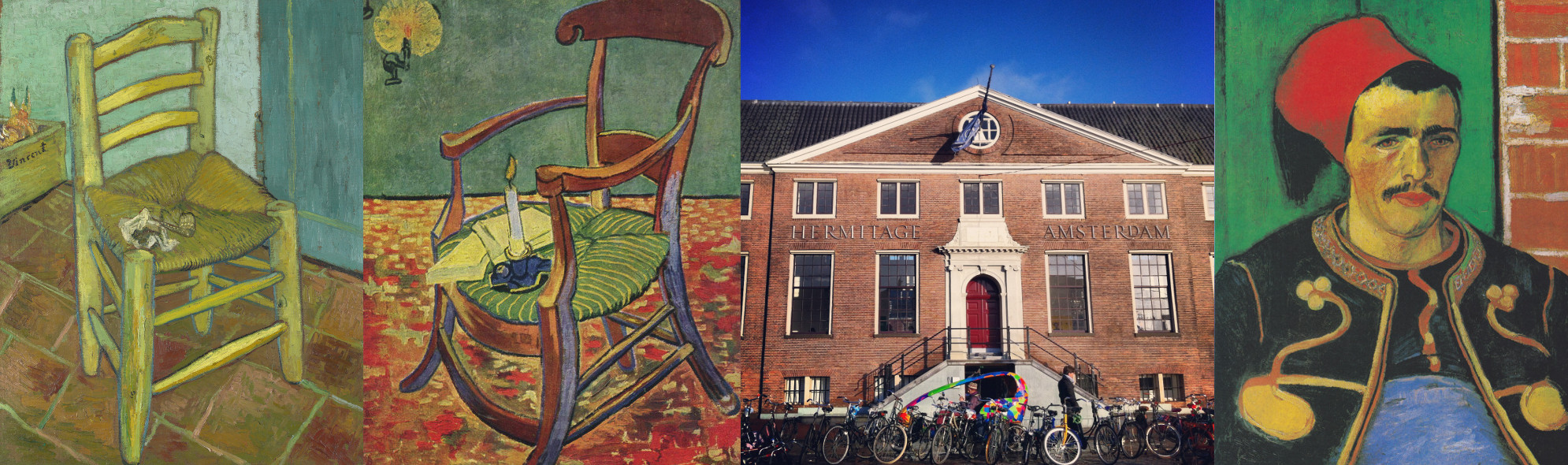
The Hermitage Amsterdam’s exhibition Vincent – bringing together seventy-five of the paintings of Vincent van Gogh, plus drawings and letters, whilst the Van Gogh Museum undergoes refurbishment – is into its final few weeks. The exhibition, which began 29 September last year, will run until 25 April; with the works then being relocated to the Museumplein for the reopening of the Van Gogh Museum on 1 May.
Van Gogh’s temporary stay at the Hermitage Amsterdam has allowed his paintings to be shown in a novel way: his works are displayed not chronologically, but according to seven themes – in order, ‘Practice makes perfect’, ‘A style of his own’, ‘The effect of colour’, ‘Peasant painter’, ‘Looking to Japan’, ‘The modern portrait’, and ‘The wealth of nature’ – with a room or section devoted to each theme, and each section’s walls a different colour. The strength of this approach is that it juxtaposes the broad range of techniques by which Van Gogh painted; shows where subject matter and method remained consistent despite a divergence of painterly styles; and highlights illuminating points of connection between paintings which might not otherwise be displayed together. Over the final few weeks of the exhibition, I intend to discuss and compare here a few of the paintings which Vincent has encouraged me to consider and appreciate.
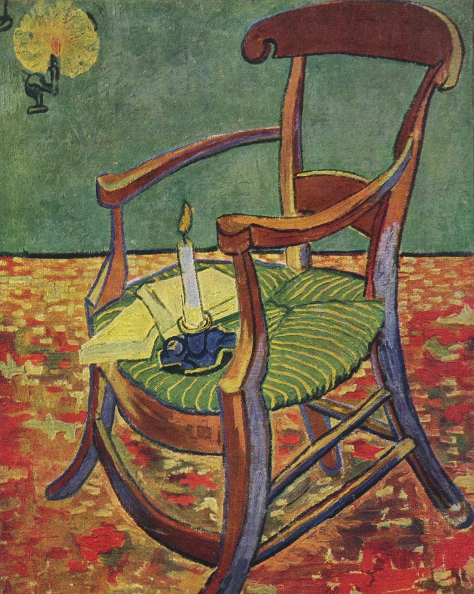
As its heading indicates, the third theme and the third room of the exhibition has as its focus Van Gogh’s use of colour. In particular, it consists of a group of paintings significant for their use of bold colour and bold colour contrasts (the room itself is notable for bearing one of the paintings from Van Gogh’s Arles Sunflowers series). Two of the paintings which have most stood out for me from this room are Gauguin’s Chair and The Garden of Saint-Paul Hospital: painted a year apart; featured a few paintings apart in the room; and both predominating in reds and greens.
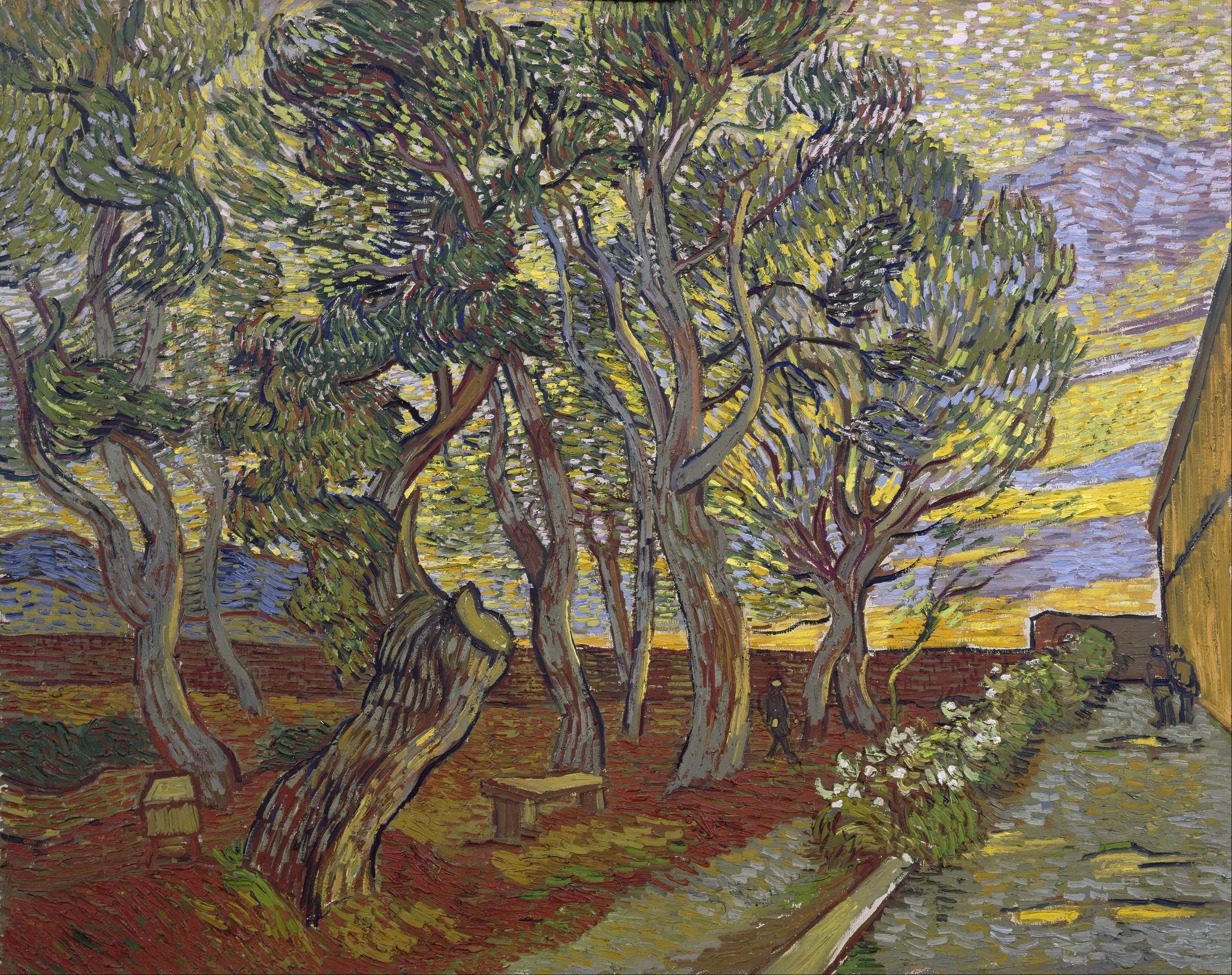
The caption the museum provides for The Garden of Saint-Paul Hospital notes Van Gogh’s psychological interpretation of the colours in the painting. It draws upon a letter Van Gogh sent to his fellow painter Émile Bernard on 26 November, 1889, whilst finishing off work on the canvas. That letter can be read in full here; the two paragraphs in which Van Gogh depicts his painting read:
Here’s description of a canvas that I have in front of me at the moment. A view of the garden of the asylum where I am, on the right a grey terrace, a section of house, some rosebushes that have lost their flowers; on the left, the earth of the garden — red ochre — earth burnt by the sun, covered in fallen pine twigs. This edge of the garden is planted with large pines with red ochre trunks and branches, with green foliage saddened by a mixture of black. These tall trees stand out against an evening sky streaked with violet against a yellow background. High up, the yellow turns to pink, turns to green. A wall — red ochre again — blocks the view, and there’s nothing above it but a violet and yellow ochre hill. Now, the first tree is an enormous trunk, but struck by lightning and sawn off. A side branch thrusts up very high, however, and falls down again in an avalanche of dark green twigs.
This dark giant — like a proud man brought low — contrasts, when seen as the character of a living being, with the pale smile of the last rose on the bush, which is fading in front of him. Under the trees, empty stone benches, dark box. The sky is reflected yellow in a puddle after the rain. A ray of sun — the last glimmer — exalts the dark ochre to orange — small dark figures prowl here and there between the trunks. You’ll understand that this combination of red ochre, of green saddened with grey, of black lines that define the outlines, this gives rise a little to the feeling of anxiety from which some of my companions in misfortune often suffer, and which is called ‘seeing red’. And what’s more, the motif of the great tree struck by lightning, the sickly green and pink smile of the last flower of autumn, confirms this idea.
The notion that the interplay of reds and greens in the painting relate to a ‘feeling of anxiety’ is interesting in its own right, and conducive for comparison; especially since the same combination is to be found in Gauguin’s Chair.
Gauguin’s Chair was completed in December, 1888. Van Gogh had moved to Arles from Paris in February of that year, enticed by the warmer climate – his health was poor; he was suffering from a persistent cough – and having some idea of forming an artists’ colony. Staying at a couple of hotels, he signed a lease for what would become known as the Yellow House, 2 Place Martine, on 1 May; but didn’t move into the house until late September when, furnishing it with two beds, he began to prepare for the arrival of Gauguin, whom he had enthusiastically encouraged to come and stay. Gauguin arrived 23 October; but just a couple of months later tensions between the pair had reached such a point that, so the account goes, on the evening of 23 December, Van Gogh stalked Gauguin through the streets of Arles with a razor, before ultimately cutting off part of his own ear.
Gauguin returned to Paris. Van Gogh spent the next few months in and out of hospital until, on 8 May, 1889, he entrusted himself to the care of the asylum of Saint-Paul-de-Mausole, in Saint-Rémy. Van Gogh was initially confined by his doctor to the asylum’s walled garden; though he gradually began taking trips out into the surrounds, he painted numerous paintings of the garden and of details within it, its trees, tree branches and flowers. The canvas The Garden of Saint-Paul Hospital showing at the Hermitage Amsterdam is one of two nearly identical paintings of the Saint-Paul garden, which Van Gogh painted between November and December (within Van Gogh’s catalogue, F numbers 659 and 660).
Van Gogh mentioned Gauguin’s Chair in four letters to his brother Theo (letters 721, 736, 751, and 767, written between November 1888 and May 1889) and in one to the art critic Albert Aurier (letter 853, in February 1890). He calls the ‘twin studies’ – that is, Gauguin’s Chair and Van Gogh’s Chair, the painting of his own chair, with pipe, which he completed in tandem – ‘rather funny’; notes their ‘thick impasto’; and describes the former’s ‘broken tones of red and green’ in the letter to Aurier, in which he writes warmly of Gauguin and states that he owes Gauguin ‘a great deal’. Yet Van Gogh offered no analysis of the work, nor suggested any revealing purpose for it.
It is tempting to view the twin studies as comprising, together, a piece of artistic symbolism – a mode of expression, incidentally, more associated with Gauguin. The empty chairs themselves encourage a symbolical interpretation; and knowing the difficulties in the two painters’ relationship, and the disastrous climax of their time spent living together in Arles, it is easy to see Van Gogh’s Chair – with its soft blues and bright yellows and oranges – representing warmth and openness, the reds and greens of Gauguin’s Chair Van Gogh’s way of suggesting something agitated, even deceptive in his companion. There are other points which could be made – Van Gogh’s chair appears less sturdy, more prone to flight, where Gauguin’s merges with the floor – but Van Gogh’s remarks concerning the palpable anxiety of The Garden of Saint-Paul Hospital support this point-of-view.
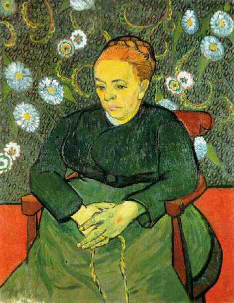
Yet at the same time as Van Gogh was working on Gauguin’s Chair, he began a group of paintings of Augustine Roulin which feature a decidedly similar palette and thick application of paint. Augustine Roulin and her husband, Joseph, a postman, became close friends with Van Gogh during his time in Arles, and he painted numerous studies of both husband and wife, as well as their three children. Completing his first painting of Augustine in December 1888, Van Gogh would repeat the same composition four more times: twice in January, and once in February and March. He entitled these paintings La Berceuse, which means ‘The Lullaby’. The March repetition is in the collection of and has been recently showing at the Stedelijk Museum in Amsterdam.
As implied by the title he gave to the paintings, Van Gogh saw La Berceuse evoking a sense of maternal affection and comfort. He considered the painting first in a letter which he sent to Gauguin, on 21 January, after Gauguin’s departure; then expanded on his thoughts to Theo on 28 January:
On the subject of that canvas, I’ve just said to Gauguin that as he and I talked about the Icelandic fishermen and their melancholy isolation, exposed to all the dangers, alone on the sad sea, I’ve just said to Gauguin about it that, following these intimate conversations, the idea came to me to paint such a picture that sailors, at once children and martyrs, seeing it in the cabin of a boat of Icelandic fishermen, would experience a feeling of being rocked, reminding them of their own lullabies. Now it looks, you could say, like a chromolithograph from a penny bazaar. A woman dressed in green with orange hair stands out against a green background with pink flowers. Now these discordant sharps of garish pink, garish orange, garish green, are toned down by flats of reds and greens. I can imagine these canvases precisely between those of the sunflowers – which thus form standard lamps or candelabra at the sides, of the same size; and thus the whole is composed of 7 or 9 canvases.
In a letter to Theo around 23 May, Van Gogh detailed his strengthening conception that the Berceuse paintings should form tritptychs with the Arles Sunflowers series. Van Gogh’s idea was that a La Berceuse should sit in between two Sunflowers; and he wanted both Theo and Gauguin to possess versions. A consideration of the colour combinations this would entail – red and green flanked by orange and yellow – emphasises that Van Gogh may have considered his two chair paintings decidedly complementary, rather than somehow opposed or antagonistic. Exhibitions which feature the paintings routinely display the chairs facing away from one another, thereby running with a symbolic interpretation which is in tune with the popular account of relations between the artists. Van Gogh, of course, painted the Arles Sunflowers to greet Gauguin and to decorate the house he hoped they would contentedly and productively share.
Van Gogh’s contemplating on La Berceuse eschews any simple analysis of Gauguin’s Chair. As viewers we may have recourse to look also towards the rhythms and contours of Van Gogh’s painting; and may wonder at the differences which demarcate and define portraits, studies of objects, and paintings of and in nature. There are other paintings too in Van Gogh’s oeuvre which play on contrasts between red and green: for instance, Paul Gauguin (Man in a Red Beret), which Van Gogh is believed to have painted in early December 1888, with its swirls of green in Gauguin’s jacket, his rich red beret set against the lime-coloured walls, and a peculiar grey brushstroke serving as his nose; and The Zouave, whose red cap is backed by a green door, painted in June 1888.


