Archives For November 30, 1999 @ 12:00 am

VG3

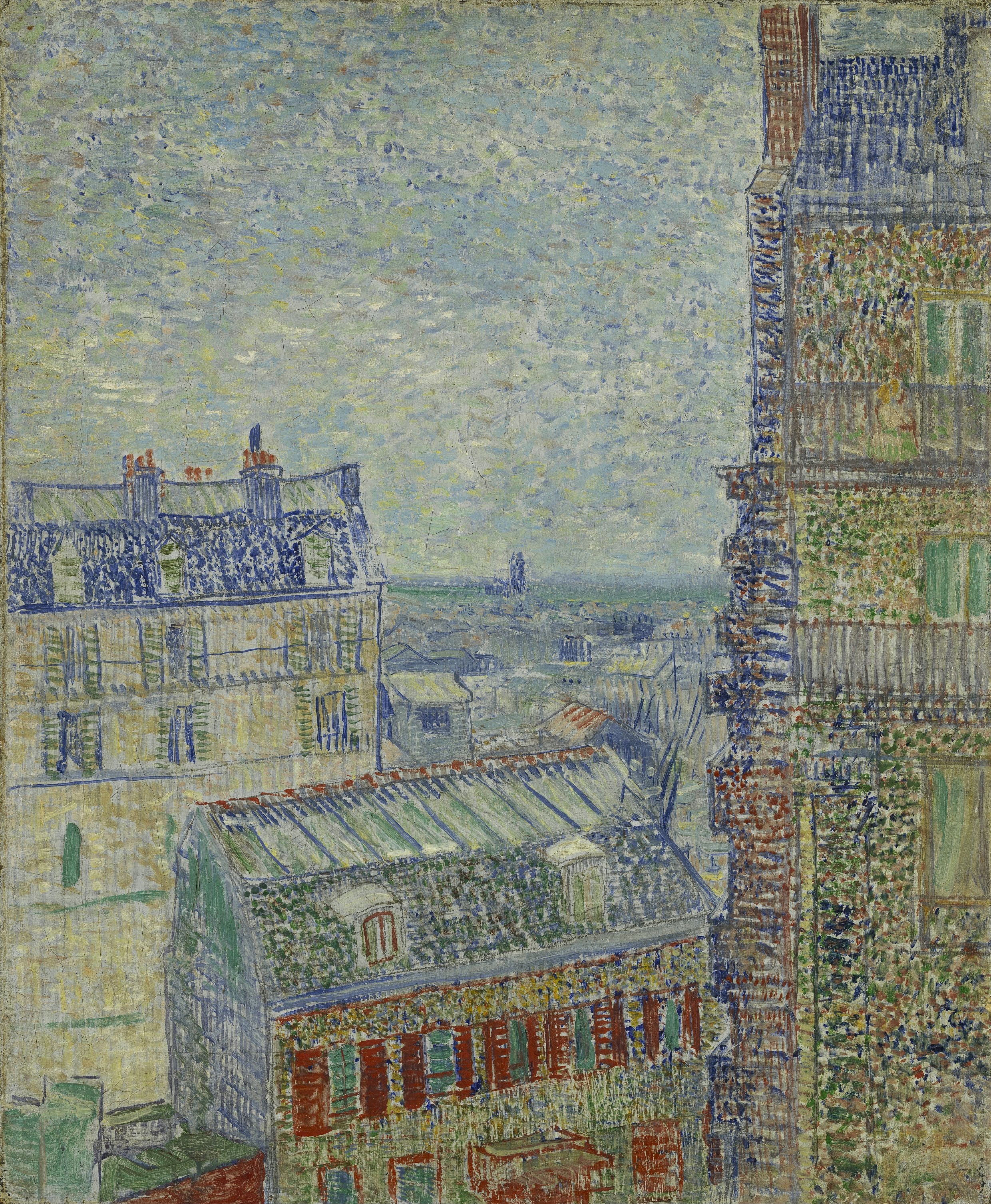
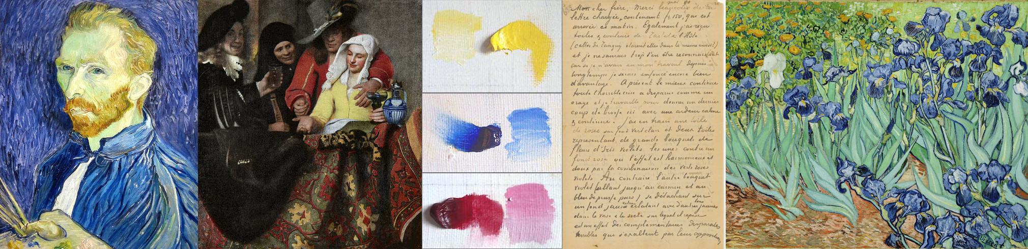
The Van Gogh Museum in Amsterdam reopened after seven months a few days ago, 1 May – the culmination of a renovation process which I briefly discussed over at amsterdamarm. The new exhibition which marks the museum’s reopening is entitled Van Gogh at Work, and is the product of eight years of research undertaken by the Van Gogh Museum, the Cultural Heritage Agency of the Netherlands, and researchers from Royal Dutch Shell. This research has brought various confirmations and some new insights regarding Van Gogh’s working practices, his artistic techniques, and his use of materials. We now know, for instance, that during Van Gogh’s two years in Paris, he bought his canvases from the same shop as his colleague Toulouse-Lautrec; and have gained a sense of the frequency with which he recycled canvases, painting over works or utilising both canvas sides.

The research also extends and establishes our understanding of the way in which some of Van Gogh’s pigments have changed and faded through the course of years. The resulting change in the colour of some of Van Gogh’s paintings is the central theme of articles written about the reopening in The New York Times (‘Van Gogh’s True Palette Revealed‘) and The Guardian (‘Van Gogh’s true colours were originally even brighter‘).

Vincent_van_Gogh_-_De_slaapkamer_-_Google_Art_Project

The New York Times piece discusses in particular Van Gogh’s The Bedroom (or Bedroom in Arles). The title refers to three oil paintings: the first painted in Arles in October 1888; the subsequent two painted after the original, in September 1889, whilst Van Gogh was a patient at the asylum of Saint-Paul-de-Mausole, in Saint-Rémy. The New York Times focuses on the initial painting, held by the Van Gogh Museum; and explains that, whilst its ‘honey-yellow bed pressed into the corner of a cozy sky-blue room’ is so familiar to us today, in fact Van Gogh originally painted the walls of the room in violet. The red pigment which he used to mix this violet has faded over time, leaving only the blue. Marije Vellekoop, the Van Gogh Museum’s head of collections, research and presentation, comments, ‘For me, the purple walls in the bedroom make it a softer image. It confirms that he was sticking to the traditional colour theory, using purple and yellow, and not blue and yellow’.

This diminishing of pigment is less evident in the two Saint-Rémy paintings. The second version of The Bedroom, in the collection of the Art Institute of Chicago, shows more intense, cornflower-blue walls. This version is on loan from Chicago for the duration of the Van Gogh Museum’s exhibition, displayed side-by-side with the Arles rendition. The third version of the painting, held by the Musée d’Orsay, bears more trace of the original violet, the colour of its walls approaching lavender.

Vincent_van_Gogh_-_The_Bedroom_-_Google_Art_ProjectVincent_van_Gogh_-_Van_Gogh's_Bedroom_in_Arles_-_Google_Art_Project

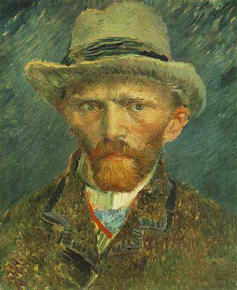
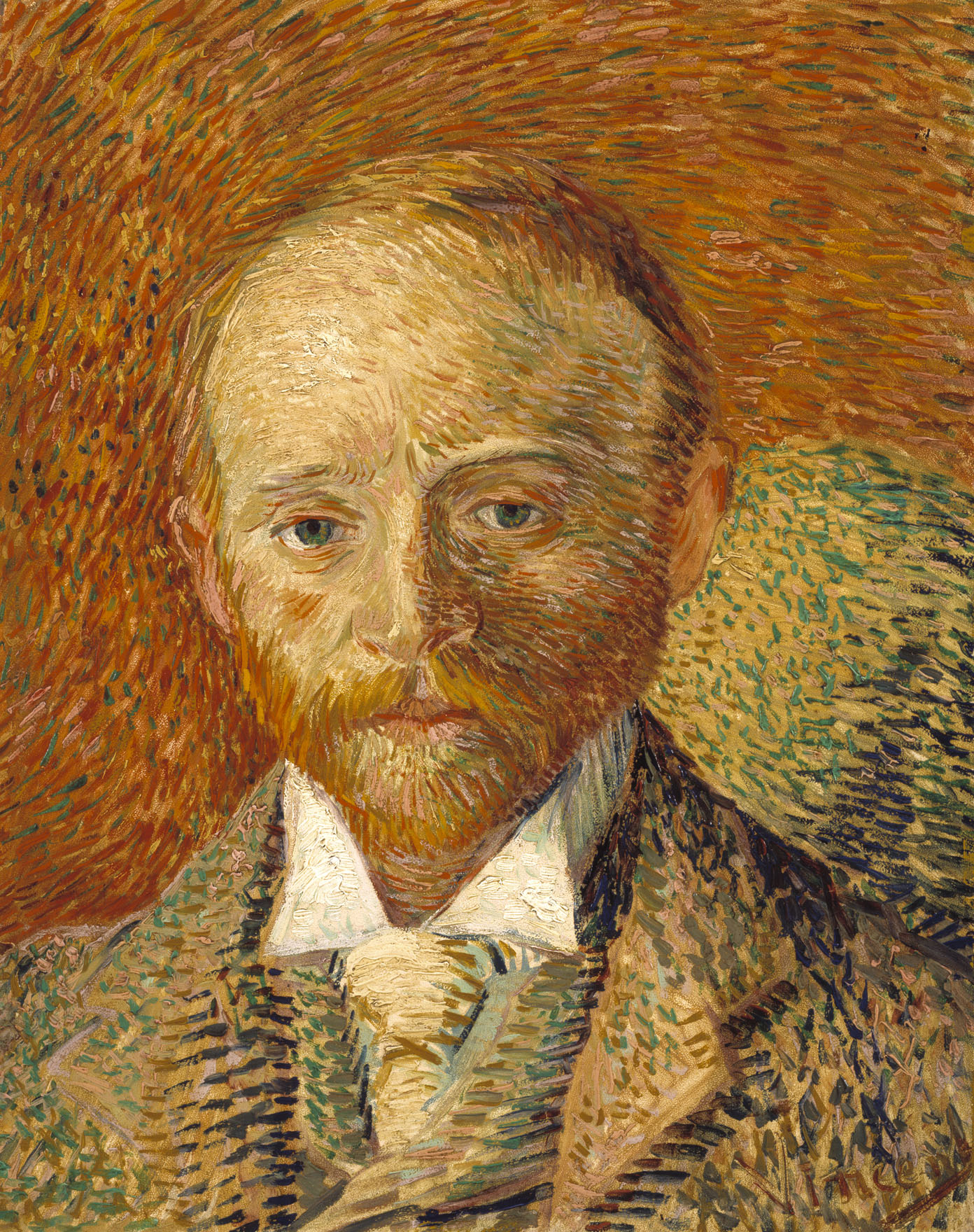
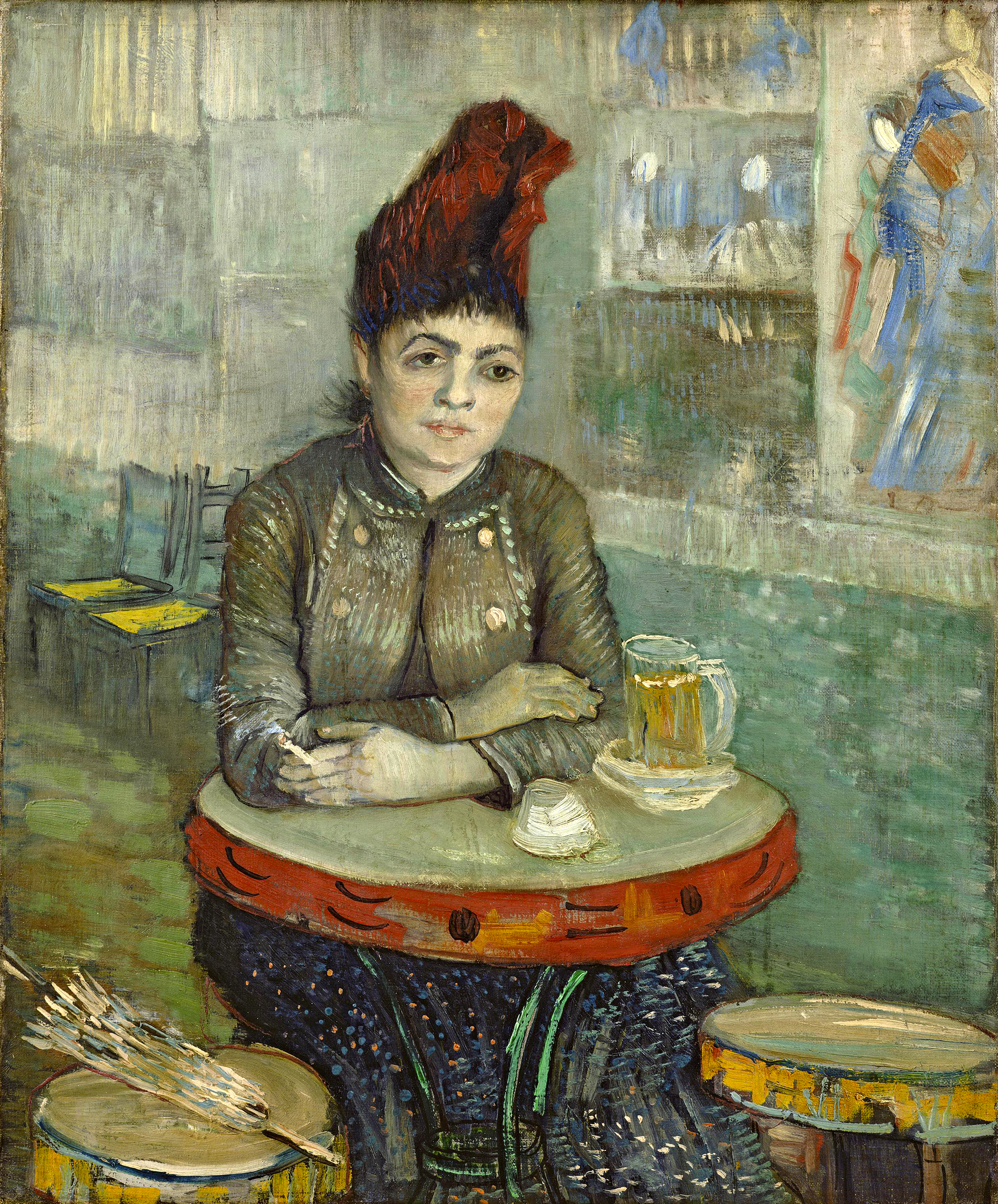
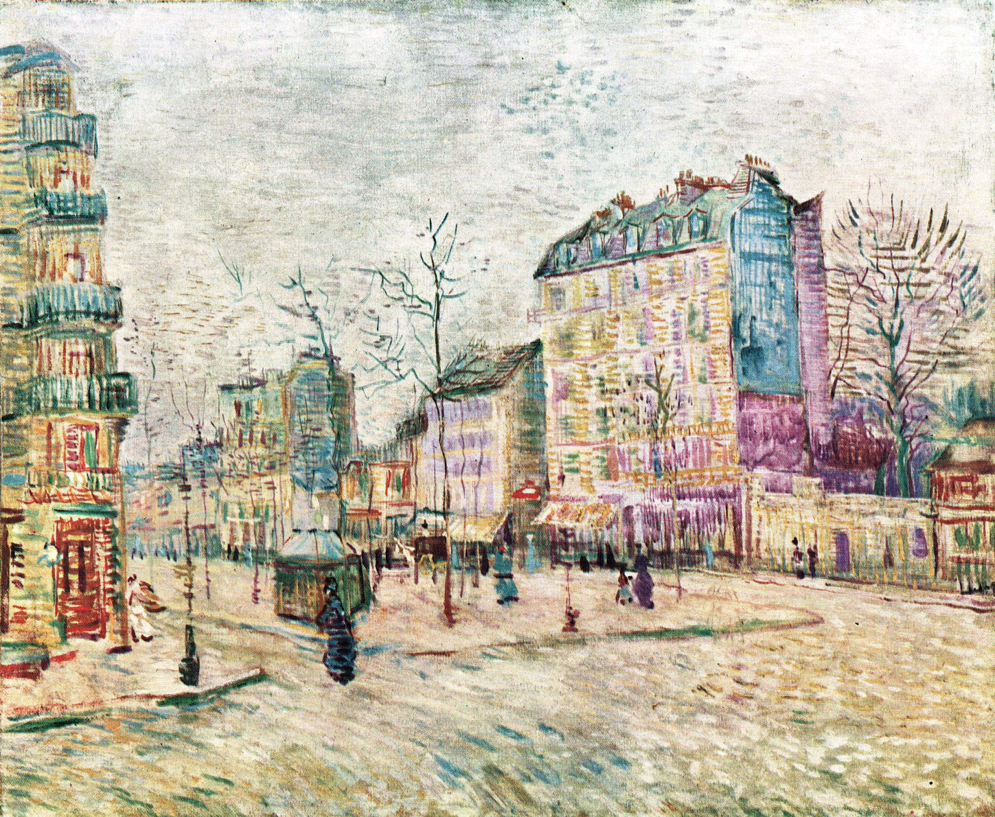
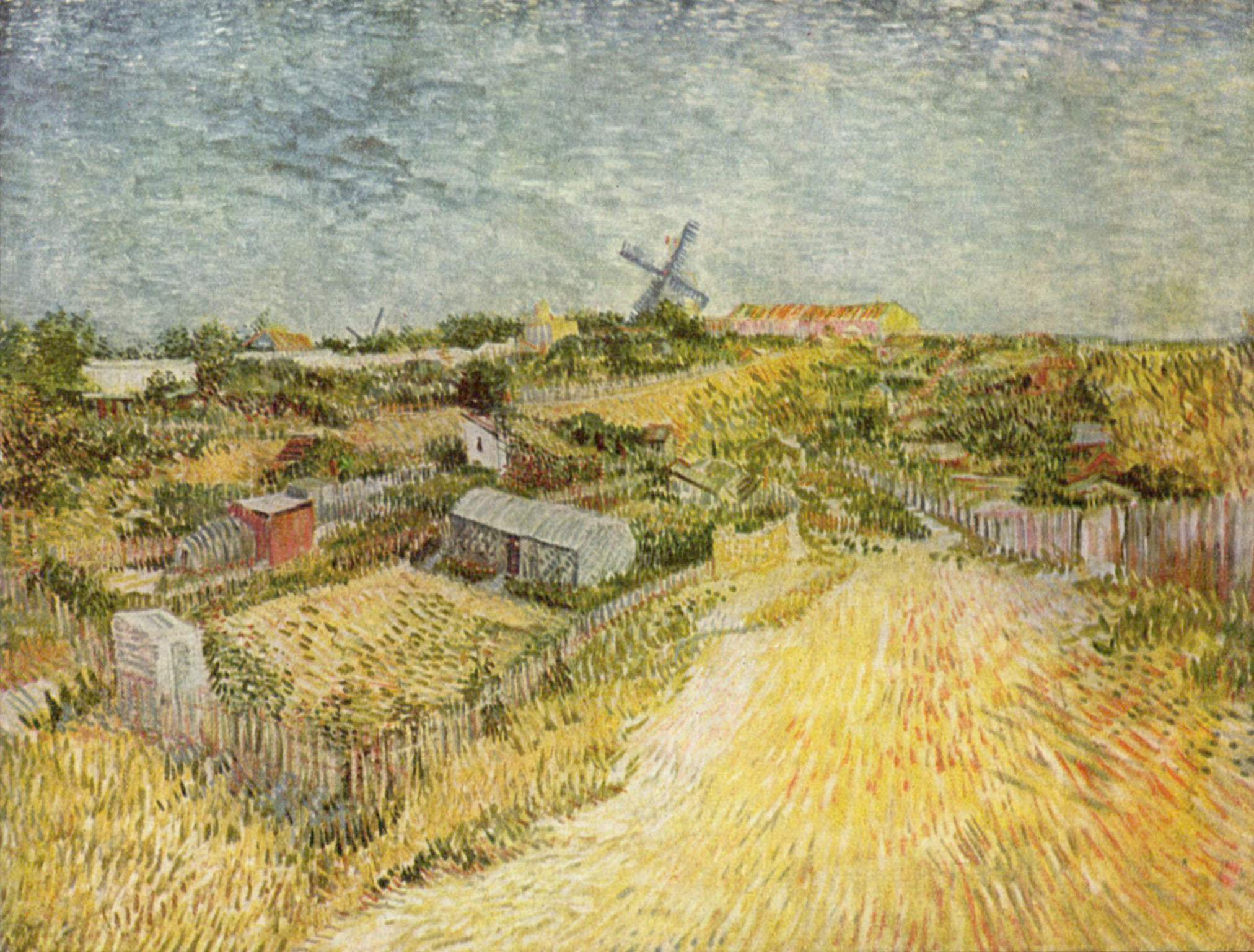
The emphasis in the New York Times on these particular colour combinations – on violet and yellow becoming blue and yellow – relates to my series on Van Gogh, inspired by the previous collection of his works at the Hermitage Amsterdam. The first piece in that series, published early last month, is titled ‘Gauguin’s Chair and La Berceuse: Conceptualising Red and Green in the Art of Van Gogh‘. The second piece, published at the start of this week, discusses ‘Van Gogh in Paris: The Radicalising of a Palette and a Brush‘. In it, I depict the months he spent in Antwerp, between late 1885 and early 1886, as crucial to Van Gogh’s artistic development. It was in Antwerp that he studied colour theory and began to broaden his palette; inspired as he was upon arriving in the city by the busy, varied life of its docks, and by the Japanese woodcuts he found on sale there.

This, the third piece in my series, considers precisely the occurrence of a violet and yellow contrast becoming a contrast of yellow and blue. Namely, I want to view Van Gogh’s Still Life: Vase with Irises Against a Yellow Background, and compare it with Johannes Vermeer’s The Milkmaid.

WLANL_-_artanonymous_-_Irissen

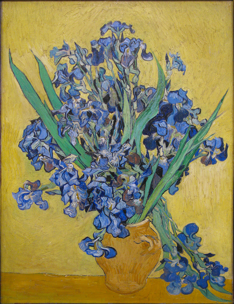
Still Life: Vase with Irises Against a Yellow Background was one of the last paintings Van Gogh worked on in Saint-Rémy. He completed it in May 1890, before leaving the hospital and moving to Auvers-sur-Oise; where – after achieving dozens more canvases, including his innovative double-square paintings – he would die at the end of July. In marked contrast with the rest of his artistic career, Van Gogh painted relatively few still lifes during his time at Saint-Rémy, painting instead outdoors, in the hospital’s gardens and then in the surrounding countryside. Though he frequently appreciated the order imposed by life at the hospital, and painted prolifically, he continued to experience periods of deep anguish and physical illness.

After suffering what the director of the asylum described as an ‘attack’ on 22 February, Van Gogh kept painting, but wrote few letters over the next two months (he received letters meanwhile from Theo and Gauguin among others; his paintings had recently been shown at Les XX’s annual exhibition in Brussels, and with the Artistes Indépendants in Paris, to the warm acclaim of his fellow artists). This attack motivated his decision, made in early May, to leave for Auvers. Vase with Irises Against a Yellow Background was therefore presumably undertaken with his move already firmly in mind. In a couple of letters, Van Gogh writes of working in a ‘frenzy’ during his last few days in Saint-Rémy.

He had completed two studies of irises, out in the garden of Saint-Paul, the previous May, soon after committing himself to the asylum following his time in Arles. Theo greatly admired these, and submitted them to the Société des Artistes Indépendants’ annual exhibition in September. Vase with Irises Against a Yellow Background was one of two still lifes with irises which Van Gogh painted a year after these studies. In his own words, in a letter to Theo,

At the moment the improvement is continuing, the whole horrible crisis has disappeared like a thunderstorm, and I’m working here with calm, unremitting ardour to give a last stroke of the brush. I’m working on a canvas of roses on bright green background and two canvases of large bouquets of violet Irises, one lot against a pink background in which the effect is harmonious and soft through the combination of greens, pinks, violets. On the contrary, the other violet bouquet (ranging up to pure carmine and Prussian blue) standing out against a striking lemon yellow background with other yellow tones in the vase and the base on which it rests is an effect of terribly disparate complementaries that reinforce each other by their opposition.

The crisp contours of the leaves and the Japanese-influenced diagonals of the flowers are set against a background which moves thickly around them. Indeed, Van Gogh painted this background last, after the flowers and vase. Yet in the painting as it appears today, the carmine – that pure, rich red which Van Gogh mentions as a facet of it – only faintly remains. As with The Bedroom‘s walls, the violet flowers have turned blue. In this manner, Van Gogh’s art makes explicit the idea that all art is involved in a continual process of becoming. In the particular case of Vase with Irises Against a Yellow Background, Van Gogh’s painting has become a perfect Vermeer: echoing in its current form Vermeer’s predisposition for the bold and brilliant use of yellow and blue.

Johannes_Vermeer_-_Het_melkmeisje_-_Google_Art_Project

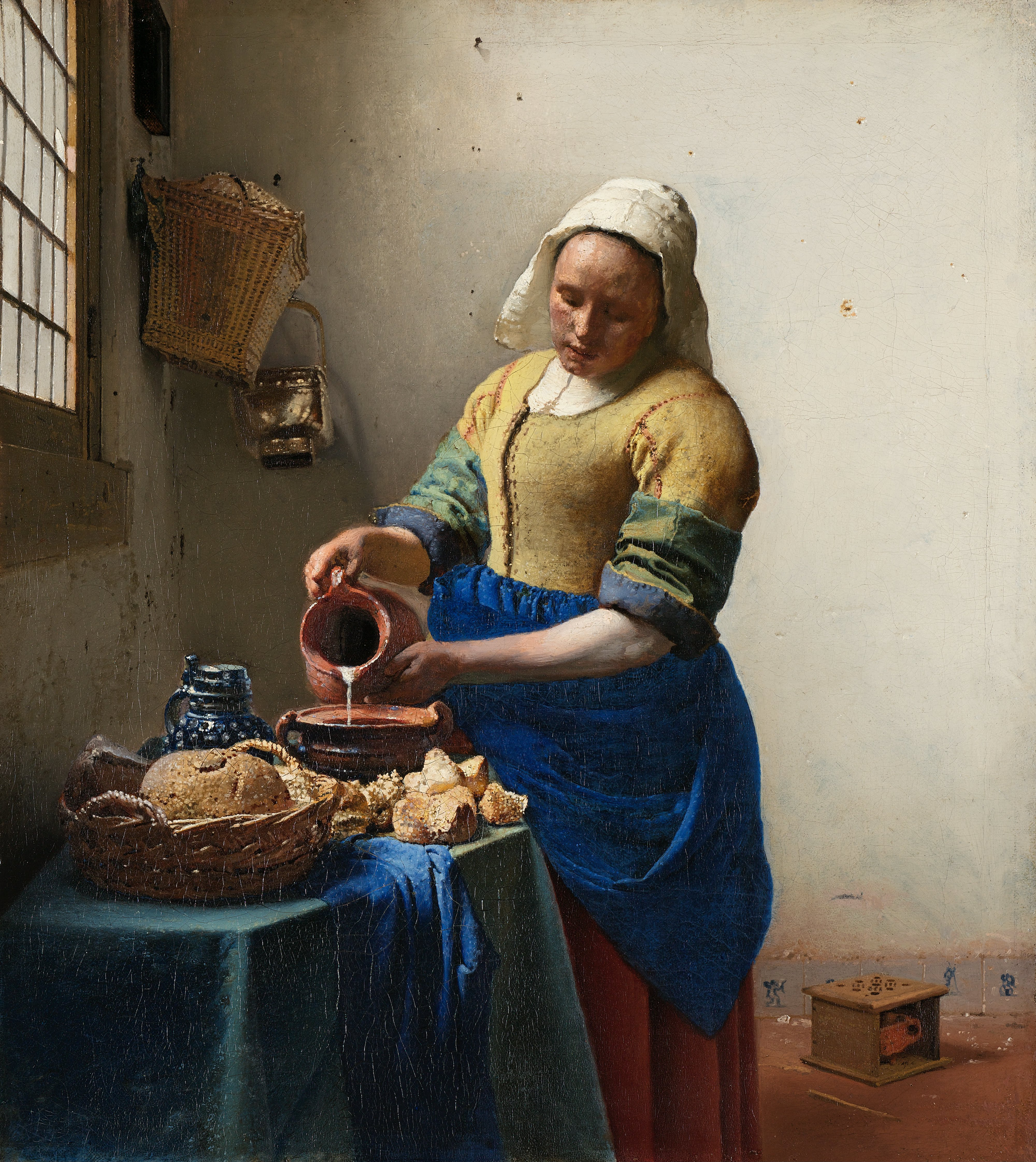
Vermeer’s The Milkmaid evinces both this predisposition for colour and his strikingly modern painterly techniques. It was painted around 1668, when Vermeer was just twenty-five years old. In some respects Vermeer is a difficult artist to analyse, for only 34 paintings remain attributed to him, and there is a dearth of material and information relating to his studies and preparatory methods. He appears about 1665 already remarkably accomplished and mature. Broadly, there is something readier, a little rougher, more captured than composed about his earlier works.

Yellow and blue are the dominant colours of The Milkmaid. In the organisation of these, Van Gogh’s Vase with Irises Against a Yellow Background appears like The Milkmaid reversed. The distinguishing feature of Vermeer’s palette, when contrasted with those of his contemporaries, was his use of expensive natural ultramarine: this gives his blues here an exceptional vividness, in tune with his similarly luminous handling of lead-tin yellow. Yet the colour combinations in The Milkmaid are complex and various, and not limited to yellow and blue. The contrast in these colours is repeated in the rich contrast between the green of the tablecloth and the maid’s carmine-red skirt.

The same green depicts the milkmaid’s rolled oversleeves, which Vermeer painted alla prima (wet-on-wet), mixing and working the yellow and blue of the maid’s shirt and apron. This method was not uncommon amongst Early and Golden Age Dutch painters: it was adopted by Jan van Eyck and by Rembrandt for several of their compositions. It became a characteristic of many Impressionist and Post-Impressionist paintings, aided by the new availability of pigments in portable tubes, which allowed artists like Van Gogh to go out into nature and paint rapidly en plein air.

A further aspect which links Vermeer to the art of the Impressionists is his use of a pointillé technique – patterns of small dots which, to a modern eye, evoke the pointillism of Seurat and Signac, with which Van Gogh experimented. Collections of small, white dots add texture and suggest the play of light in Vermeer’s painting, noticeable especially on the bread and on the top of the maid’s apron; highlighting also her cap, oversleeves, and the lip of the jug with which she pours. They enhance the atmosphere of softly diffusing light which characterises this brilliant but gentle, boldly restrained, most harmonious of works.

Van_Gogh_Self-Portrait_with_Grey_Felt_Hat_1886-87_Rijksmuseum

A few weekends ago, I began what is intended as a short series, impelled by the selection of paintings by Vincent van Gogh which have been on show at the Hermitage Amsterdam. The exhibition there, entitled Vincent, comprised a thematic arrangement of seventy-five paintings whilst the Van Gogh Museum was undergoing refurbishment. It came to a close – having run since September – at the end of last week; with the Van Gogh Museum to reopen this Wednesday, 1 May.

The purpose of my series is to consider and draw out some of the aspects and juxtapositions which the thematic display at the Hermitage Amsterdam suggested. I gave the first piece in my series the title Gauguin’s Chair and La Berceuse: Conceptualising Red and Green in the Art of Van Gogh’. This is the second of the series; a third part will be published here over the next week.

Having essentially foregone an early career as an art dealer; then failing on his explicitly religious mission; Van Gogh turned to art around 1880, at the age of twenty-seven. He had drawn frequently while pursuing a religious ministry in the Borinage through 1879; dismissed from his post there by the authorities – due to his unkempt appearance and squalid living conditions, which rendered him indistinguishable from the miners and peasants he was supposed to be ministering to – Van Gogh embarked in earnest on an artistic pathway; and in 1880 was encouraged to travel to Brussels, where he enrolled, in November, at the Académie Royale des Beaux-Arts, to study drawing formally.

He was in Brussels only a few months before moving with his parents to Etten, where he resumed drawing the countryside and the locals. After a string of arguments with his family concerning his lifestyle, his prospects, and his forceful and hasty attempts to begin a relationship with his widowed cousin, Kee Vos-Stricker, Van Gogh departed from his family in late 1881, and moved to The Hague. It was here that Van Gogh began painting. He was instructed in oil and watercolour by his cousin-in-law, the realist painter Anton Mauve. Though he continued to admire Mauve, and held him as a model artist, the pair soon fell out – owing, Van Gogh believed, to Mauve discovering and disapproving of his nascent relationship with Clasina Maria Hoornik, ‘Sien’, a prostitute who was pregnant when she and Van Gogh first met. Van Gogh lived with Sien, her young daughter, and her infant son, from the middle of 1882 until the autumn of 1883 – when he abruptly left, moving to Drenthe, then soon on to Nuenen.

Van Gogh’s first acclaimed artistic compositions were painted in Nuenen. Commencing at the beginning of 1884, the numerous studies Van Gogh made of weavers, of still lifes, of peasants’ heads, culminated in The Potato Eaters, which he completed in April 1885. There are some consistencies in these early paintings with Van Gogh’s later works: shared compositional characteristics, for instance a perspective when painting buildings whereby the top and front of the building comes towards the viewer, appearing both sturdy and dynamic (compare The Cottage (1885) and Old Cemetery Tower at Nuenen (1885) with The Church at Auvers (1890)); and a thick application of paint. Yet these Nuenen scenes were dark, often dimly lit and with brown the predominant colour; there are none of the vivid colour combinations, bold lines and lively brushstrokes for which Van Gogh is most recognised.

Van Gogh’s art changed in stages and owing to key influences. He left Nuenen for Antwerp in November 1885. Immediately enthralled by Antwerp’s bustling docks, and by the Japanese woodcuts on sale there, he conflated the two in a letter to Theo soon after arriving, on 28 November. In this letter, he evocatively describes the mass of contrasting figures and scenes which have caught his eye on walks about the docks; and tellingly for his art explains:

One of De Goncourt’s sayings was ‘Japonaiserie for ever’. Well, these docks are one huge Japonaiserie, fantastic, singular, strange — at least, one can see them like that.

I’d like to walk with you there to find out whether we look at things the same way.

One could do anything there, townscapes — figures of the most diverse character — the ships as the central subject with water and sky in delicate grey — but above all — Japonaiseries.

I mean, the figures there are always in motion, one sees them in the most peculiar settings, everything fantastic, and interesting contrasts keep appearing of their own accord.

The overall effect of the port or of a dock — sometimes it’s more tangled and fantastic than a thorn-hedge, so tangled that one can find no rest for the eye, so that one gets dizzy, is forced by the flickering of colours and lines to look now here and now there, unable to tell one thing from another even after staring at a single spot for a long while.

Whilst in Antwerp, Van Gogh took exams at the city’s Academy of Fine Arts. However, he was drinking heavily and became sick, and in March moved to Paris where he stayed, despite his brothers’ reservations, with Theo. The two years Van Gogh spent in Paris before departing for Arles were full of experimentation; he was able to view the Impressionists and Cézanne, but was propelled most by his fervour for ‘Japonaiseries’, his introduction to the works of Monticelli, and his acquaintance with Paul Signac. His palette became progressively brighter and more colourful, and towards the end of 1886, and through the spring of 1887, his brush came to life.

Van Gogh large

A number of paintings from this period – the endpoints and focal paintings of this piece – demonstrate this conflux of influences. In late 1886 Van Gogh began a group of portraits which evince looser brushstrokes and highlights, resulting in more nuanced and energetic works of art. These include Self-Portrait with Grey Felt HatPortrait of a Man with a Skull Cap, the first two of three portraits of Père Tanguy (the first a typical portrait, the second highly colourised with Tanguy seated in front of a Japanese screen and Japanese prints – which Van Gogh reworked a year later for the third piece); and Portrait of the Art Dealer Alexander Reid.

Vincent_van_Gogh_-_In_the_café_-_Agostina_Segatori_in_Le_Tambourin_-_Google_Art_Project_2

Compared with these portraits, around March 1887, Agostina Segatori Sitting in the Café du Tambourin is less posed, Van Gogh capturing Agostina from a short distance, seemingly lost in thought, with a single Japanese print suggested on the wall behind. All of these paintings are radical extensions – in colour and in brushwork – upon the portraits Van Gogh had painted previously. Some of the street scenes and landscapes which Van Gogh produced in the same spring appear more radical departures than extensions in any linear sense.

boulevard-de-clichy-1887(1)

Boulevard de Clichy is comprised of short, narrow, but consistent lines, and an almost neon palette with prominent greens and pink-purples. The thin application of paint, with the canvas apparent between brushstrokes, is quite unlike the impasto of Van Gogh’s later career. The colours and the dress and poise of the figures show the effects of the Japanese woodcuts Van Gogh was continuing to collect. View of Paris (or View of Paris from Vincent’s Room in the Rue Lepic) demonstrates a thicker application of paint, and the marked influence of the pointillism practiced by Seurat and Signac; quick lines are joined and overlaid by dots of paint, with juxtapositions of blue and yellow, green and red.

Vincent_van_Gogh_-_View_from_Theo’s_apartment_-_Google_Art_Project

The Stedelijk Museum recently altered those Van Goghs showing from its collection; La Berceuse has left the wall, and in its place has appeared one of a group of paintings Van Gogh made of vegetable gardens in Montmartre. Completed towards that summer, Vegetable Gardens in Montmartre (also known as Kitchen Gardens in Montmartre) shows the same utilisation of thin lines and vibrant colours, here moving rhythmically in all directions to produce a coherent composition. These paintings, as much as Van Gogh’s emerging qualities as a painter, emphasise his skill as a draughtsman; echoing his drawings, predating his revolutionary use of the reed pen in Arles.

Vincent_Willem_van_Gogh_045

le-chateau-de-medan

In a piece on Cézanne’s Banks of the Marne, published on this site several weeks ago, I mentioned and briefly considered, by way of comparison, the painting Zola’s House at Médan. The painting is just as often referred to as Le Château de Médan; it was painted between 1879 and 1881; and is now part of the Burrell Collection in Glasgow.

Over the last week I have been reading through a book on Cézanne by Hajo Düchting, published by Taschen, entitled on the front cover simply Cézanne; with the title page expanding upon this via the provision of a subtitle, 1839-1906, Nature into Art. The book makes particular mention of Zola’s House at Médan; and includes a lengthy quotation by Gauguin which I thought was worth republishing here.

Gauguin is recorded as the painting’s first owner, purchasing it from the Parisian art supplier and art dealer Julien François Tanguy. Over the course of years, Tanguy established in his shop quite a collection of Impressionist paintings, owing to the fact that, where money was lacking, he accepted paintings in exchange for paints. He was called Père by his artists, and sold, or attempted to sell, works by Monet, Sisley, Seurat and Van Gogh alongside Cézanne and Gauguin. Van Gogh painted him three times, the latter two paintings increasingly experimental, Japanese-inspired portraits.

Gauguin’s remarks provide us with his own sense of the interplay of colours in Cézanne’s painting. They continue with a second-hand account of an occurrence which took place with Cézanne mid-paint. This account is humorous in its evocation of the professorial passer-by, it provides a nice depiction of Cézanne’s character, and it is also a suggestive shot of a perhaps not atypical contemporary response to Cézanne’s work. Here is Gauguin:

Cézanne is painting a shimmering landscape against an ultramarine background, with intense shades of green and ochre gleaming like silk. The trees are stood in a row like tin soldiers, and through the tangle of branches you can make out his friend Zola’s house. Thanks to the yellow reflections on the whitewashed walls, the vermilion window shutters take on an orange tone. A crisp Veronese green convey the sumptuous leafage in the garden, and the sobre, contrasting shade of bluish nettles in the foreground renders the simple poem even more sonorous.

A presumptuous passer-by takes a shocked glance at what seems, in his eyes, to be a dilettante’s wretched daubing, and asks Cézanne in a professorial voice, with a smile,

‘Trying your hand at painting?’

‘Yes – but I’m no expert!’

‘I can see that. Look here, I was once a pupil of Corot. If you don’t mind, I’ll just add a few well-placed strokes and set the whole thing right. What count are the valeurs, and the valeurs alone.’

And sure enough, the vandal adds a few strokes of paint to the shimmering picture, utterly unabashed. The oriental silk of this symphony of colour is smothered in dirty greys. Cézanne exclaims: ‘Monsieur, you have an enviable talent. No doubt when you plant a portrait you put shiny highlights on the tip of the nose just as you would on the bars of a chair.’

Cézanne picks up his palette once more and scratches off the mess he has made. Silence reigns for a moment. Then Cézanne lets fly a tremendous fart, and, gazing evenly at the man, declares: ‘That’s better.’

Monet WITGMonet – Jeanne-Marguerite Lecadre in the Garden (1866)

Monet COTGAM

Monet – Corner of the Garden at Montgeron (1876)

Monet PAM

Monet – Pond at Montgeron (1876)

Monet MAG

Monet – Meadows at Giverny (1888)

The exhibition Impressionism: Sensation and Inspiration at the Hermitage Amsterdam – contextualising Monet, Renoir, Pissarro, Degas and Sisley by juxtaposing them with their 19th Century forebears, contemporary Salon artists, intermediaries and successors; and which I mentioned in a previous piece on Cézanne’s Banks of the Marne – ended last weekend. I visited on Sunday and looked in particular at four canvases by Claude Monet, placed consecutively but at some distance apart in the largest of the exhibition’s rooms, showing Monet’s art across three decades of his career.

Together they demonstrate the way in which Monet’s work moved through and beyond Impressionism. Often considered the arch Impressionist, typifying the movement’s emphases on painting en plein air, and using vivid colours to display the transitory effects of sunlight, Monet’s art should not be reduced and perceived only as a mirror of the movement. The four paintings show different approaches to composition, and Monet achieving Impressionistic results then extending his art in the direction of pure subjectivity, tending towards abstraction. They show too that a vastly diminished palette can produce something which more closely depicts the way we see, and which abounds more fully in light.

The earliest painting on display, Jeanne-Marguerite Lecadre in the Garden (also known as Woman in the Garden, Sainte-Adresse), was completed in 1866, when Monet was just twenty-six years old. It appears the most composed, the most ordered of the four paintings; and well demonstrates Monet’s predilection for painting ordered nature, in the form of gardens and enclosed scenes. Three principal objects – Jeanne-Marguerite; the central white tree, in bloom, with red flowers underneath; and the yellower tree to the right – and their shadows, at equal distance from one another, structure the space. The vibrant reds of the flower bed complement the greenery, and throw the woman’s white, sun-lit dress into relief. There is a visual progression also from the vivid white of the dress through the blooming central tree, to the smaller trees and flowers which enclose the scene at the far right.

Monet would later depict shadows comprised of shades of blue, even in paintings of the summer. His experimentation with blue shadows was one of the things which led critics of his work in Paris in the 1870s to call his works ‘leprous’. In Jeanne-Marguerite Lecadre in the Garden the shadows are dark and solid, and the use of blue delimited to the sky in the upper right corner of the painting. The effect suggests a warm and still summer day. Yet the stillness of the sky, a block of blue more steely than azure; the solidity of the shadows and the other darker tones in the painting; its order; and the relative flatness of the canvas, of the brushstrokes in the grass and in the trees in the background – all this gives a sense of something staged and static. The light which illuminates the woman’s umbrella is not as luminous upon and does not pick out in the same way the trees to the picture’s centre and right. The overall atmosphere becomes somewhat unsettling, an image approximating that of the geometrically defined garden which features, intercut, in the film Last Year at Marienbad.

With the outbreak of the Franco-Prussian War in July 1870, Monet spent eight months in England, then four in the Netherlands before returning to France. The painters he was able to study during this time – notably Turner and Constable – significantly influenced the specifics of his art. In 1876 he completed a series of four canvases commissioned by Ernest Hoschedé, a wealthy department store magnate, and intended to furnish the drawing room of his château at Montgeron, on the outskirts to the south-east of Paris. The two paintings Corner of the Garden at Montgeron and Pond at Montgeron are more Impressionistic in their quicker, looser brushstrokes: the former lifted by a vivid and lively cyan-blue sky atop distant hills; the latter capturing a woman who leans on the trunk of a tree whilst she fishes, the sunlight breaking through the trees in a flurry of light-blue horizontals reflecting off the pond’s water. The two paintings depict a wilder, obviously much more expansive garden, and Monet’s handling of light is more consistent.

Still, there is something potentially problematic inherent in Monet’s methodological imperative. His insistence on painting in nature, attempting to capture the essence of its fleeting moments, encourages the quick application of unmixed colour – and the result can sometimes be slightly jarring, lacking in subtlety, the colours not quite coming together. The use of a limited palette is a logical and practical extension of Monet’s devotion towards painting en plein air.

Meadows at Giverny was painted twelve years after the Montgeron canvases, in 1888. Through the course of those twelve years, Monet lost his wife. Camille – who frequently modelled for Monet as well as Manet and Renoir, and with whom Monet had two children – died of illness in 1879. In 1883, Monet discovered Giverny, a commune on the right bank of the Seine in northern France. He rented a house there and moved with his family, which now comprised not only his children, but also Alice Hoschedé and hers: the two families had lived together briefly before Camille died and before Ernest moved to Belgium in the late 70s; and Monet and Alice would marry in 1892 after Ernest’s death. By 1888 Monet was emerging from the poverty he and his family had suffered through the late 60s and 70s, with Paul Durand-Ruel selling more and more of his works. He was able to buy his house at Giverny, plus additional land, in 1890, and would live there until his own death in 1926.

In Meadows at Giverny there are four predominant colours – two greens, an ochre and a lilac-grey. With the minor addition of a few strokes of pink and blue – the blue a variation, a darker tone of the lilac-grey, used in the shadows – these colours alone comprise the painting. This canvas as well as any suggests Cézanne description of Monet’s talent: ‘Nothing but an eye, but, my God, what an eye’. The brushstrokes are short and close and criss-cross in the foreground, and are more sweeping in the sky; the paint is laid thickly, producing an awareness of fluid shape and texture. The colours interplay harmoniously, the atmosphere is airy; the painting stands as a pure evocation of light.

Banks of the Marne, by Cézanne

January 18, 2013 @ 4:21 pm — 8 Comments

Banks of the Marne

The Hermitage Amsterdam is currently home to two complementary exhibitions. The first, Impressionism: Sensation and Inspiration, with a tagline explaining that the works on display are ‘Highlights from the Hermitage’, endeavours to place the Impressionists within their French Nineteenth Century context. It shows Neoclassicists Alexandre Cabanel and Jean-Léon Gérôme, the Romanticism of Delacroix – who Van Gogh regarded as the supreme colourist, and about whom he wrote in September, 1888,

‘Now, it is true that I see in impressionism a resurrection of Eugène Delacroix, but as the interpretations are both divergent and also rather irreconcilable, impressionism cannot yet formulate a doctrine. That is why I am staying with the impressionists, because it means nothing, and commits you to nothing, and as one of them I do not have to take up any position.’

– and intermediaries, including Charles-François Daubigny and Carolus-Duran, alongside Monet, Pissarro, Degas, Sisley and Renoir.

The second exhibition, entitled simply Vincent, with the subtitle ‘The Van Gogh Museum at the Hermitage’, shows a selection from the Van Gogh Museum’s collection whilst that museum is undergoing refurbishment in order to meet updated Dutch safety and security regulations. The exhibition is organised thematically rather than chronologically, the seven themes comprising, in order, ‘Practice makes perfect’, ‘A style of his own’, ‘The effect of colour’, ‘Peasant painter’, ‘Looking to Japan’, ‘The modern portrait’, and ‘The wealth of nature’. Whilst some of the earlier themes in particular are conceptually slight, the exhibition itself is coherent and succeeds in providing novel points of connection. Impressionism is open until January 27; whereas Vincent will run until the end of April, when the Van Gogh Museum will reopen with a major exhibition celebrating the museum’s fortieth anniversary, to be called Van Gogh at Work.

I visited Impressionism last weekend, and especially admired a painting by Cézanne, Banks of the Marne (1888). Cézanne achieves in this painting one of the purest and most convincing depictions of water I’ve seen; and he does this by largely replicating the river bank in the water below, presenting a reflection that is almost a mirror image. The trees and the residence on land appear reflected at the same angle, and with the same dimensions. Cézanne’s palette – with its predominant blue-greens offset by the white villa and its ochre roof and balcony – also remains constant, with the darker tones in the water serving to differentiate and providing a sense of depth. Whilst there is nothing amounting to a rippled brushstroke, the short and dense diagonals which give the trees their matter are replaced in Cézanne’s water by looser horizontals.

Around 1888 when Cézanne painted Banks of the Marne, he also worked on a number of other water paintings, experimenting with different ways of representing, different ways of bringing his canvases together. Bridge over the Marne at Créteil, with its view looking down the river, features geometric curves and larger blocks of colour as trees, reflected in the water with vertical rather than horizontal brushwork. From the same period, the more abstract Bridge over a Pool consists of a mass of vivid green diagonals which encroach upon and enclose the bridge, the water only delineated by some darker tones and shadows; and Aqueduct and Lock repeats Banks of the Marne‘s trick, the aqueduct immediately mirrored in the water below, here slightly extended and outlined, with unfastened foliage hovering above on each side.

Banks of the Marne recalls an earlier work, Zola’s House at Médan (or Le Château de Médan), which Cézanne completed between 1879 and 1881, Zola having bought the house in 1878. The painting depicts the banks of the Seine – of which the Marne is a tributary, running southeast from Paris – in an unusually rigid and symmetrical fashion: whereas Banks of the Marne is broadly split into river bank and river, here the canvas is divided into the five horizontal sections of river, river bank, houses, hills and sky, with tall trees rising vertically at regular intervals between the houses. Cézanne’s palette is much brighter, the sensation sunnier, with intense yellows, greens and ochres and a bold blue sky. Still, both paintings confront the viewer in a similar way: we look directly across a stretch of water towards a river bank, densely leafy, something solidly constructed and impenetrable. Like in the later painting, so here Cézanne indicates those reflections in the water through more loosely painted, horizontal brushstrokes.

De Leeuw, R. (ed.) The Letters of Vincent van Gogh, trans. A. Pomerans (Penguin, 1997)